
Final TdF Plots
Finishing up this tour plot thing - here's the final individual stage placings with the jersey holders and initial GC contenders highlighted.
The whole sawtooth trend from day-to-day held true throughout the tour, huh!?
Here's how things progressed from a GC perspective:
How many "GC days" would you pick out from this plot?
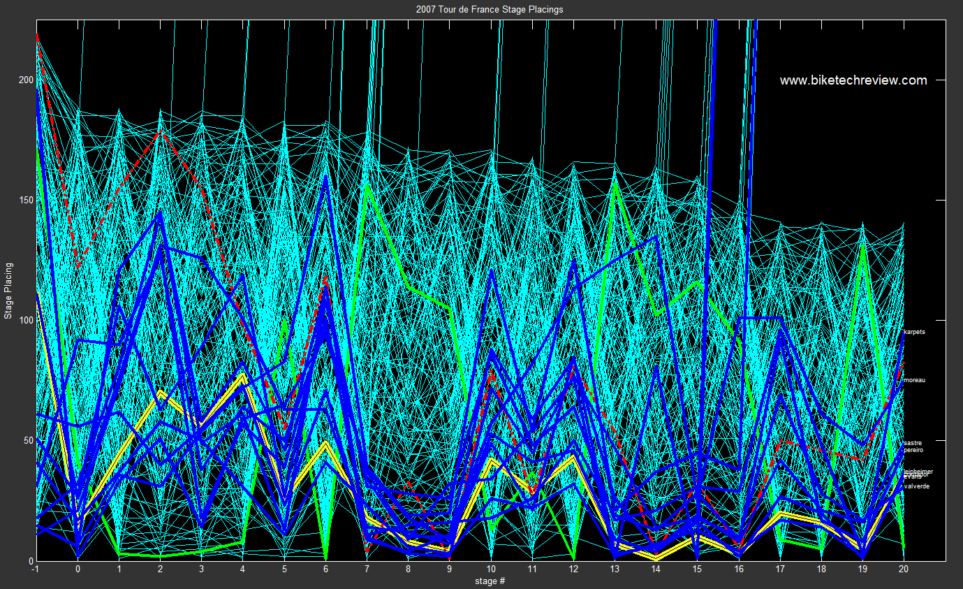
The whole sawtooth trend from day-to-day held true throughout the tour, huh!?
Here's how things progressed from a GC perspective:
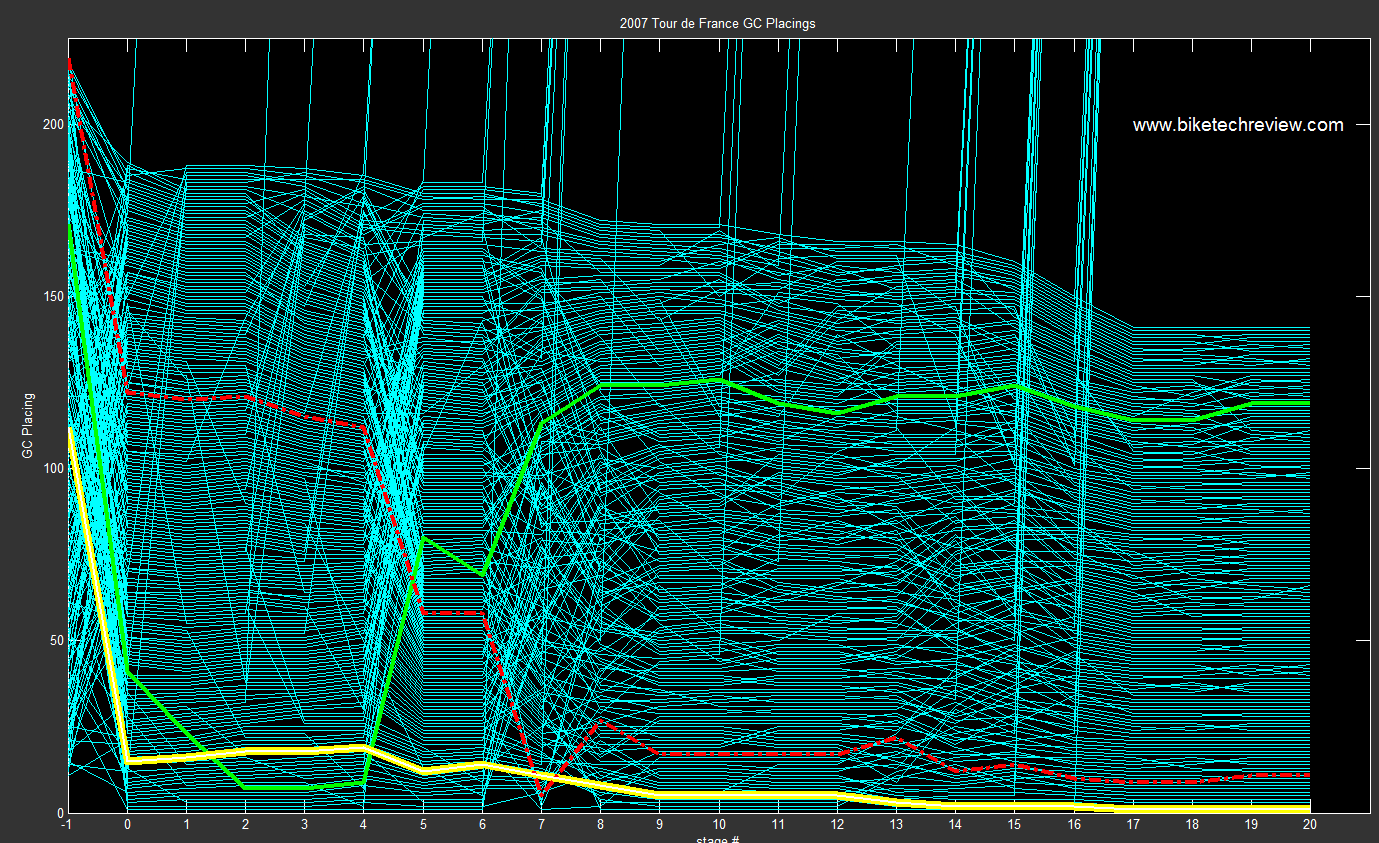
How many "GC days" would you pick out from this plot?
posted by kraig at
9:00 PM
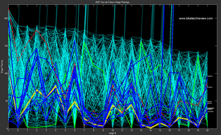
![]()
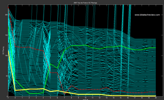
![]()


4 Comments:
Interesting plot -- saw it on another blog.
Two questions:
1. What do the different color lines mean - I'm a bike racing neophyte. Specifically, who is that red dotted line?
2. Do you have a cumulative graph somewhere that shows points leadership instead of stage placement? [forgive me if it's already been posted!]
Thanks for checking out the plots, bikechartfan!
1. - the colored lines represent all the final jersey wearers and how they placed in each stage and/or the gc (general classification) after a given stage. The yellow jersey/line is for the person who had the lowest cumulative time up until that point in the race. The green jersey/line is for the person that had the most points (points are given for stage placings and also intermediate sprints along the way). The dashed red line is for the King of the Mountains (KOM - similar to the green jersey in that the KOM jersey holder - the jersey is white with red polka dots - has scored the most points by crossing the tops of the climbs most consistently).
Here's a much better explanation about all the different jersey's at the tour:
http://en.wikipedia.org/wiki/Tour_de_France#Classification_jerseys
2) I don't have a cumulative time graph, though it conceptually would be the same as the GC placings, just might be spread out a bit more. Come to think of it, that might make a pretty neat plot!
I've got all the times and whatnot in a database, so I might be able to whip that one up!
-kraig
Kraig,
you definitely need the scaling options and cumulative times help a lot to visualize the development of the Tour.
http://statisticalgraphics.blog.com/ is a good place to start with ...
Martin
Hi Martin,
Thanks for the great feedback and the link - I knew I had seen this style of plot before, and it looks like it was on your blog:
http://biketechreview.com/phpBB2/viewtopic.php?t=1700&highlight=matlab+data+structure+file
Good stuff over on your blog, BTW!
Post a Comment
Links to this post:
Create a Link
<< Home