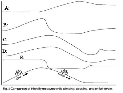
Label the Intensity Metric Plot
I was pointed to a version of this graphic over on a thai forum:

I couldn't figure out the source of the info for the graphic since it wasn't cited, but it was an interesting plot for me to consider and think about in the context of this forum discussion:
http://biketechreview.com/forum/viewtopic.php?f=1&t=2608
so, are you up for the challenge?
Let's hear what you think are the intensity metric labels for the different squiggly lines in the image above!
Labels: power, powermeter
posted by kraig at
7:00 PM
![]()
![]()


4 Comments:
Wow -- hard to resist:
A: speed
B: heartrate
C: rolling average power: peak is due climb disappearing from the averaging window (for 30 second smoothing, descent was a bit less than 30 seconds)
D: normalized power: lag due to smoothing
E: power
Hi Dan,
here's the original graphic
Pretty neat graphic, and nice to see how HR, the supercomputer, speed and power work together to tell the story.
http://www.trainingbible.com/pdf/Train_with_Power.pdf
Hey! Kraig never mentioned the "barking dog".... I'd figured that blip in C ruled it out as a HR candidate....
In data I'm looking at now (limited data with a HRM, which I no longer use), I don't observe the significant increase in HR after the cessation of effort that Friel claims in the plot. HR seems to more closely approximate a rolling average of some sort, which flattens and then declines virtually immediately with the initiation of rest (within 1 bpm or so).
Post a Comment
Links to this post:
Create a Link
<< Home